Building Scalable Components
How do you write CSS that is:
- Clean?
- Maintainable?
- Scalable?
What should I use?
- Frameworks like Bootstrap and Foundation?
- Methods like OOCSS, SMACSS, Atomic design?
Hello, I’m Zell
When I'm not desiging/coding…
- I teach FED through my blog
- Blog: https://zellwk.com
How do you write clean, maintainable and scalable CSS?

1. Proportional Scaling
2. Responsive Scaling
3. Modular Scaling
Proportional Scaling
Components scale according to:
- font-size
- viewport
Relative units
emch%
button {
  font-size: 1em;
  padding: 0.5em 0.75em;
  /* Other properties */
}/* Group common properties together */
.button {
display: inline-block;
padding: 0.5em 0.75em;
font-size: 1em;
}
.button-small {
font-size: 0.8em;
}
.button-large {
font-size: 2em;
}Using Sass mixins
@mixin button {
	display: inline-block;
  padding: 0.5em 0.75em;
  /* Other common properties */
}

.button-large {
  @include button;
  font-size: 2em;
}
Components scale according to:
- font-size
- viewport
Viewport units
vwvhvminvmax
.quarter-screen-rect {
  width: 50vw;
  height: 50vh;
}
Quarter screen rectangle
Fluid typography
Fluid Typography with vw
html {
  font-size: calc(16px + 0.5vw);
}

h2 {
  font-size: 3em;
}
For more, read fluid typography by Mike Riethmuller
Proportional Scaling:
- What property does it scale to?
- Use relative units
- Refrain from
px
Grab the freebie!
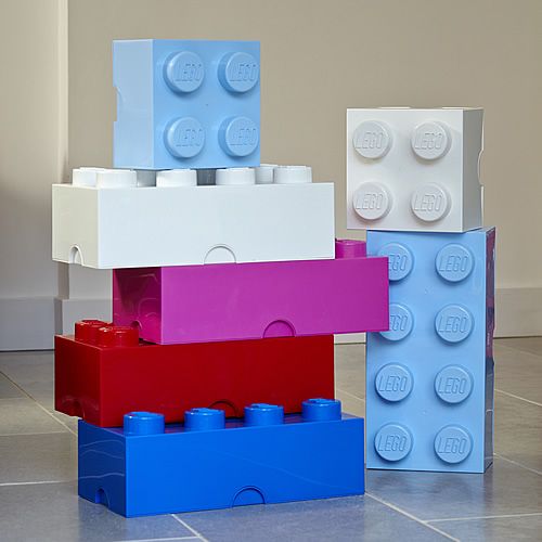
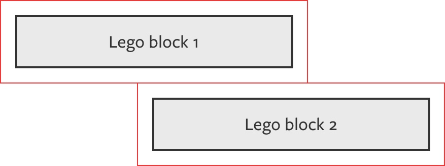
Modular Scaling
(Lego blocks)
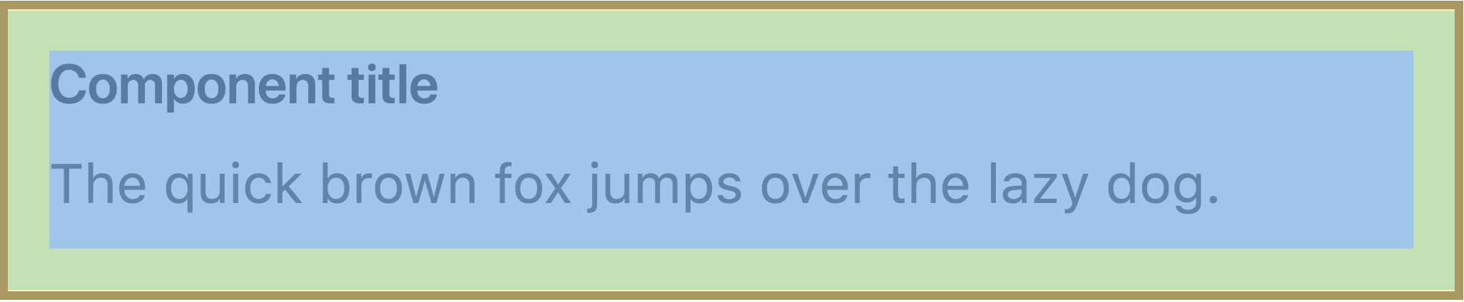
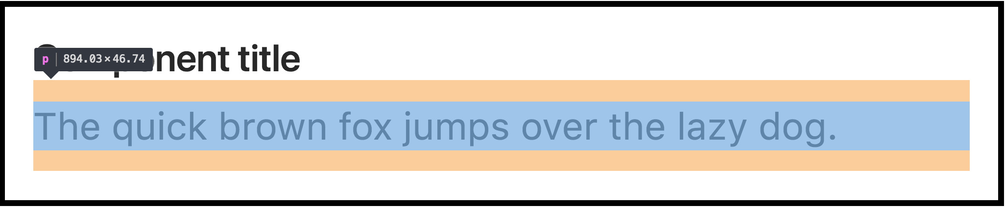
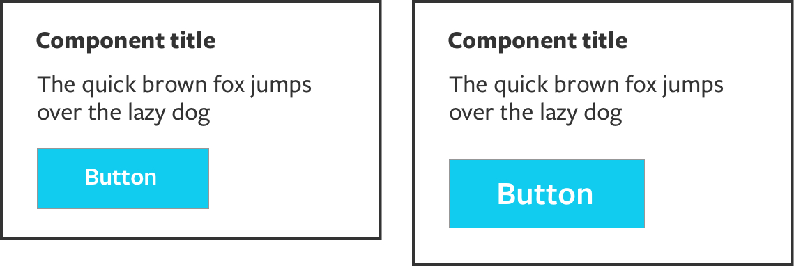
Component title
The quick brown fox jumps over the lazy dog.
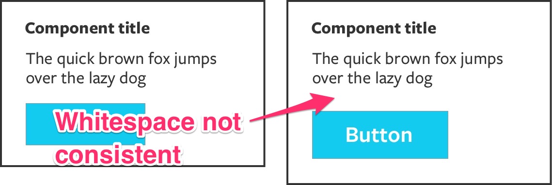
Removing the bottom margin
.component p:last-child { margin-bottom: 0 } Removing the bottom margin for everything
.module p:last-child,
.module ul:last-child,
.module ol:last-child,
.module dl:last-child {
  /* losing battle */
  margin-bottom: 0;
}
From this article on CSS-Tricks
Removing margins
h1, h2, h3, h4, h5, h6, ul, ol, li, blockquote {
	margin: 0;
	padding: 0;
}
Manage internal whitespace
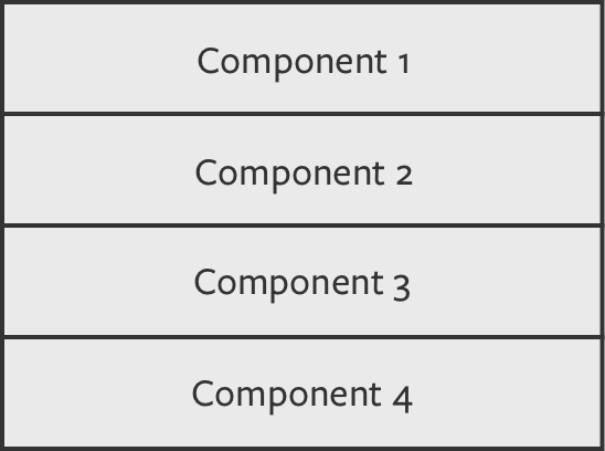
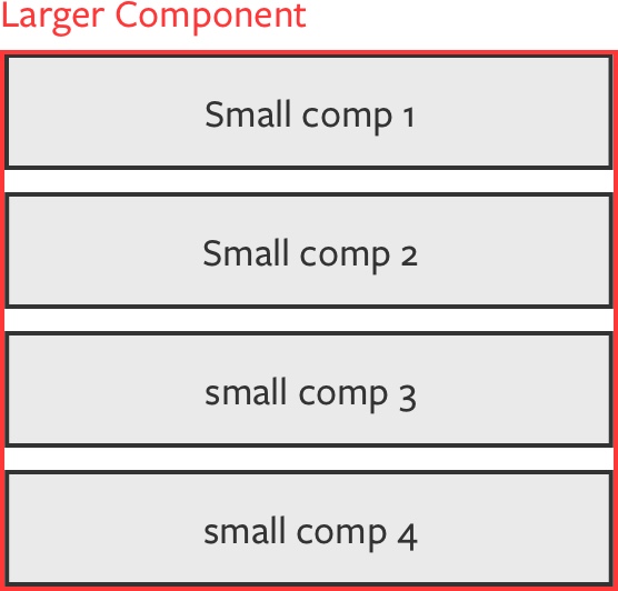
Large Component
Component
Component
Component
Component
Universal selectors with adjacent sibling selector
* + * {
  margin-top: 1em;
}

.component > * + * {
	margin-top: 1em;
}
Read lobotomized owl by Heydon Pickering
.button {
	margin-top: 1em;
	margin-bottom: 1em;
	/* Other properties */
}
.button {
	font-size: 1em;
	margin-top: 1em;
	margin-bottom: 1em;
	/* Other properties */
}
.button-large {
font-size: 2em;
margin-top: 0.5em;
margin-bottom: 0.5em;
/* Other properties */
}.button {
font-size: 1em;
margin-top: 1rem;
margin-bottom: 1rem;
/* Other properties */
}.button-large {
font-size: 2em;
/* Other properties */
}Em === local variable
Rem === global variable
Local variable !== good
Global variable !== bad
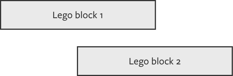
Lego blocks
- Remove external whitespace
- Manage internal whitespace
- Prevent whitespace from scaling
Responsive Scaling
Media queries
Media queries
min-widthqueriesmax-widthqueries
min-width media queries
// Note: Always write media queries in `em`.
.component {
  @media (min-width: 37.5em) {
    font-size: 2em;
  }
}
max-width media queries
.component {
  font-size: 2em;
  @media (max-width: 37.5em) {
    font-size: 1em;
  }
}
Combine min-width and max-width
Small viewport

Medium viewport

Large viewport

Media query demo
Responsive Scaling:
- media queries
- favor
min-widthovermax-width - use both when you need to!
Modular Scaling
(Morphable components)


Grid view

Single view
Grid view
Single view
Quote
Grid view
Single view
Author
Grid view
Single view
Date
Dec 31 2016
…
…
…
…
Founder Mantras demo
Morphable components may not be obvious
Your turn :)
Morphable blocks
- Find similarities and differences between views
- Craft your best-fit HTML
- Modify looks with CSS
- Minimize the number of modifiers
Additional tips
Additional tips
- Naming components
.quote {
  /* shared styles */
}
.quote--single {
/* single styles */
}
.quote--single .quote__date {
display: none;
}.quote--grid {
/* grid here */
}BEM Modifier
BEM Element
Additional tips
- Naming components
- Namespacing
- Elements:
e- - Components:
c-
- Layouts:
grid-(.grid-article) - State:
is-,has-(.is-active) - JavaScript:
js(.jsModalToggle) - Typography:
type(.type-h1,.type-h2) - Themes:
theme(.theme)
Additional tips
- Naming components
- Namespacing
- Manage specificity
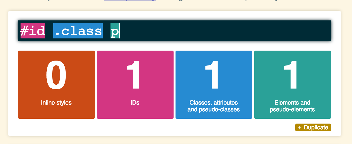
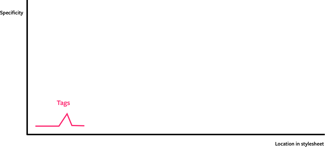
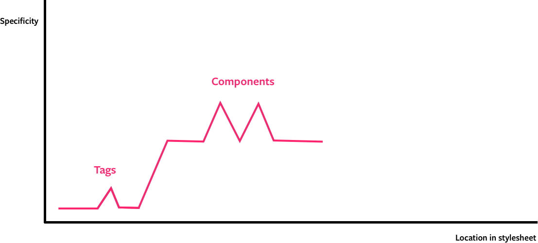
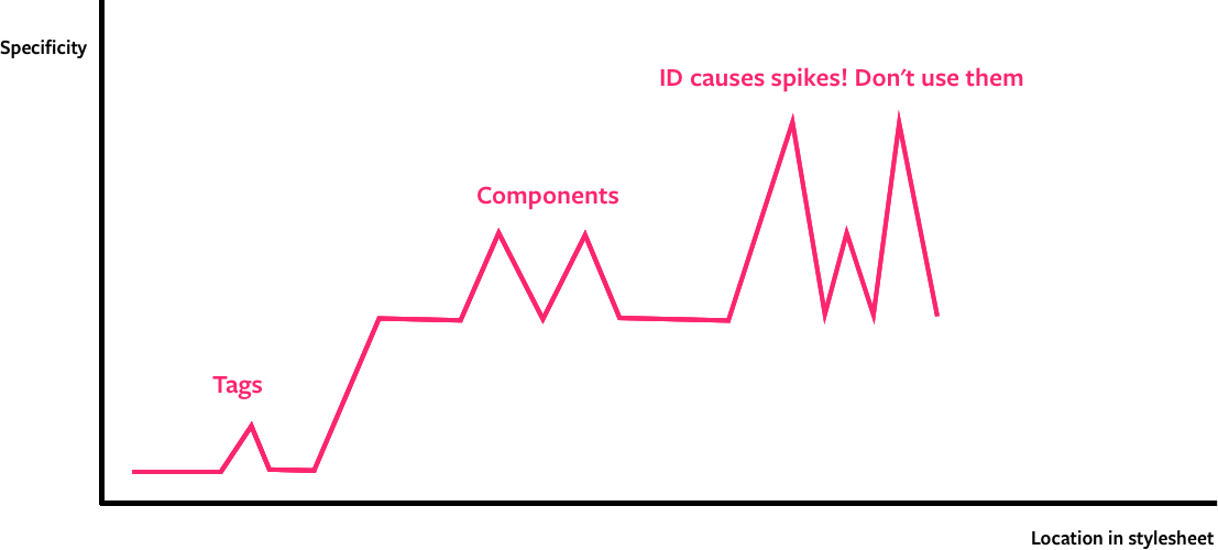
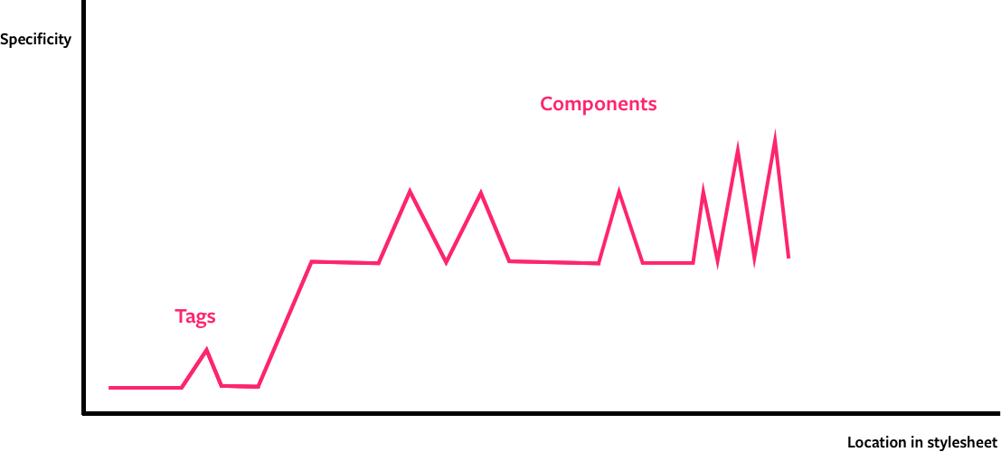
The specificity graph by Harry Roberts
Thank you!
Thank you!
- Slides: zellwk.github.io/scalable-components
- Blog: https://zellwk.com
- Twitter: @zellwk